The Power of Signage in Retail Design
Signage isn’t decoration, it’s your silent salesperson. Guide customers, build trust, and drive sales with clear, strategic in-store messaging.

Walk into any great retail store and you'll feel it before you can name it a sense of knowing exactly where you are, what's on offer, and why you should stay. Nine times out of ten, that feeling is being orchestrated quietly overhead, on the walls, and at eye level. By signage.
Retail signage is one of the most underestimated tools in a store designer's arsenal. While much of the industry conversation centres on lighting, fixtures, and floor plans, it is often a well-placed sign or the absence of one that determines whether a customer makes a purchase, asks for help, or simply walks out the door.
In a landscape where online shopping is one tap away, physical retail must justify the trip. Signage is how a store speaks. It is the silent salesperson working every hour the doors are open.
Why Signage Is a Strategic Asset
Most retailers think of signage as an operational necessity price tags, aisle markers, exit signs. But the stores that truly harness its potential treat it as a brand asset on par with their logo or their window display. Every sign is a micro-touchpoint that either builds trust and clarity or erodes it.
Consider the difference between a hand-written cardboard price sticker and a beautifully printed card that matches your store's visual identity. Both communicate price. Only one communicates value. Only one tells the customer: we care about the details.
Signage also carries a navigational function that directly impacts dwell time and basket size. Customers who can find what they are looking for quickly are less likely to feel frustrated and customers who are shown what they didn't know they needed are more likely to spend more. Both outcomes are shaped by the placement, clarity, and tone of your signs.
The numbers back this up. Studies consistently show that 76% of consumers have entered a store they'd never visited before based on signage alone, that the majority of purchase decisions are made in-store rather than beforehand, and that brands with cohesive in-store signage systems enjoy significantly higher recall among shoppers. These are not marginal gains they are structural advantages that compound over time.
What Custom Signage Should You Use for Your Retail Store?
There is no universal answer, but there is a framework. Retail signage falls into six core categories, each serving a distinct purpose in the customer journey. Understanding these categories and how they work together is the foundation of a coherent in-store communication strategy.
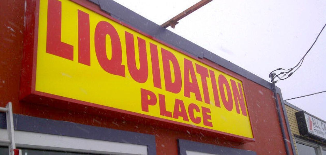
1. Fascia & Forecourt Signage (Exterior)
Your first impression before a customer sets foot inside. Fascia signs, window vinyl, A-boards, and forecourt banners all serve one mission: stop the right person on the street and give them a reason to walk in. Invest heavily here. This is your headline, and like any good headline, it needs to be clear, confident, and impossible to ignore.
2. Directional & Category Signage (Wayfinding)
Overhead hanging signs, aisle fins, and category headers reduce friction and increase exploration. Shoppers who feel lost leave. Those who feel guided stay longer and spend more. Use consistent iconography and typography to create an effortless flow through your space the customer should never have to stop and wonder where to go next.
3. Sale, Offer & Campaign Signage (Promotional)
Shelf talkers, hanging mobiles, and window posters communicate value and urgency. These are your most temporary signs, but they should look intentional, not thrown together. A poorly designed sale sign can undermine the credibility of the entire store. A well-designed one can be the single most effective driver of conversion on the floor.
4. Point-of-Sale & POS Signage (Product Level)
Price cards, product feature callouts, and "bestseller" badges live at the product level. These micro-signs do heavy lifting: they remove purchase barriers, answer objections before they're raised, and give customers permission to buy with confidence. Think of every POS sign as a miniature sales associate one that never has a bad day and never forgets the key messages.
5. Experiential & Brand Signage
Wall murals, typographic installations, mission statements, and brand story panels. These are signs that don't ask you to buy anything they ask you to believe in something. They are the emotional layer of your retail environment, and in the age of social media, they are your most shareable asset. Done well, they turn a store visit into an experience worth telling people about.
6. Digital & Interactive Displays
LED screens, digital price tags, and interactive kiosks bring flexibility and immediacy that print cannot match. They're ideal for high-traffic focal points, entrance areas, and product demonstrations. The key is integration digital signs should feel native to your brand, not grafted on as an afterthought. When digital and print signage share a coherent visual language, the result is a space that feels current without feeling cold.
The Principles of Effective Custom Signage Design
Knowing which sign types to use is only half the challenge. How those signs are designed and placed is what separates stores that communicate clearly from stores that simply have signs on the walls.
Hierarchy of information. Every sign has one job. The moment it tries to do two, it does neither well. Before designing any sign, ask: what is the single most important thing this sign must communicate? Everything else is secondary reduce it, remove it, or move it to a different sign entirely.
Brand consistency above all. Your signage system is only as strong as its consistency. When font choices, colour palettes, and material finishes are unified across every sign in your store, the result is a space that feels considered and confident. Inconsistency reads as carelessness even to customers who couldn't name the reason they feel uneasy.
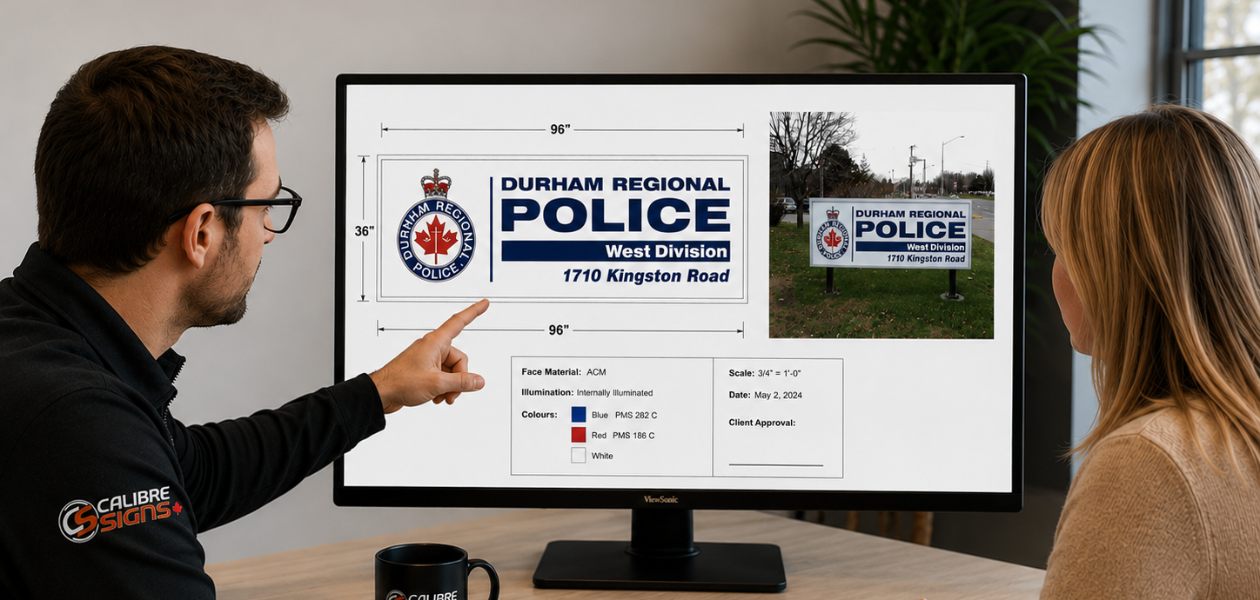
Material matters. Foam-board print, brushed aluminium, reclaimed timber, acrylic, or hand-lettered chalkboard the material of a sign communicates as much as the words on it. A luxury boutique using the same corrugated plastic sheeting as a car boot sale is sending a contradictory message. Choose materials that are congruent with your brand positioning.
Placement is everything. The best-designed sign fails if it's in the wrong place. Eye-level for product messaging. Overhead for navigation. Window-facing for capture. Proximity-to-product for purchase support. Study how your customers move through your space and put your signs one step ahead of where they naturally look.
Designer's Checklist: Before You Print
Before committing any sign to production, work through these questions:
- Does this sign have a single, clear primary message and have you removed everything that competes with it?
- Is the typeface legible at viewing distance, not just reading distance?
- Does the colour combination meet accessibility contrast standards?
- Is the material and finish appropriate for this sign's location and expected lifespan?
- Does this sign match your brand guidelines for font, colour, and tone of voice?
- Have you considered how this sign will look under your specific store lighting?
- Is the mounting or display method as considered as the sign itself?
The ROI of Getting It Right
The business case for investing in quality custom signage is straightforward: signage that works harder sells more. But the ROI extends beyond immediate conversion. A retail environment with a coherent, beautiful signage system communicates professionalism and trust and trust is the currency that drives repeat visits, word of mouth, and long-term brand loyalty.
Conversely, poor signage has a real cost that rarely shows up clearly in a profit and loss statement. Customers who can't find what they need ask staff, increasing labour pressure. Customers who don't understand a promotion are less likely to act on it. Customers who feel the space is chaotic or unclear are less likely to return. The cost of bad signage is largely invisible which is exactly why so many retailers underinvest in it.
The stores that will define the next decade of physical retail are those that understand the store itself as a medium. Signage is the language of that medium. Invest in it with the same seriousness you would give to product, staff, and the fit-out itself and it will repay you every day the doors are open.
Start with a signage audit. Walk your store as a first-time customer and note every moment of confusion, every missed opportunity then design to close those gaps.
Contact Calibre Signs Today →