What Signage Does Your Building Need to Meet AODA Requirements?
Which signs does AODA actually require? Here's what tactile, Braille and contrast rules mean for your building.
Short answer
Ontario's Accessibility for Ontarians with Disabilities Act requires tactile and Braille lettering at key identifiers such as washrooms, room numbers and exits, a measured minimum contrast between text and background, mounting heights that stay consistent throughout the building, and non-glare finishes that hold up under normal interior lighting. Most buildings get the visible, exterior pieces right and miss the interior identification that an audit checks first.
What Does AODA Actually Require for Signage?
AODA sets a floor, not a design style. The Act doesn't dictate what your signage should look like; it dictates what it has to do. That means tactile characters and Braille on permanent room and washroom identification, a minimum level of colour and luminance contrast between text and its background, mounting heights consistent enough that someone using a cane or a guide dog can locate a sign by touch and position, and finishes that don't glare or wash out under office lighting.
None of this has to compete with your brand. A compliant sign can still carry your typography, colour palette and material finish. The AODA requirements govern lettering height, contrast ratio and placement, not your logo or brand story, which is why a dedicated AODA signage program is usually built to satisfy both at once rather than treated as a separate, purely functional layer.
Which Signs Get Overlooked Most Often?
Washroom identification is the single most common gap. Buildings that get exterior accessible parking and accessible-entrance signage right frequently miss the tactile geometric symbol and Braille requirement at washroom doors, since those signs are less visible and easy to treat as an afterthought during a fit-out.
Room and suite numbering is the second. Any permanently designated room, an office, a meeting room, a mechanical or electrical room, generally needs tactile and Braille identification rather than a printed number taped or screwed to the door.
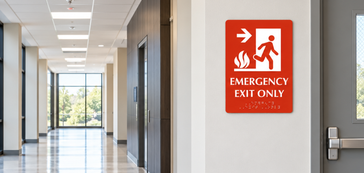
Exit and emergency signage rounds out the top three. These signs carry fire code and accessibility requirements simultaneously, and updating one without checking the other is one of the more common ways a building ends up non-compliant on a technicality after a renovation.
What Do Contrast, Tactile Lettering and Mounting Height Rules Mean in Practice?
Contrast is measured, not eyeballed. A sign that looks like it has enough contrast under office lighting can still fail a luminance contrast measurement against the wall or door behind it. This is one of the most common reasons an otherwise well-designed sign fails an audit, because contrast depends on the specific finish and colour pairing, not just a general impression of legibility.
Tactile characters have to be raised, not printed. Braille and raised lettering need to sit at a defined height above the surrounding surface, in a specific type style and size, none of which a standard flat vinyl-cut sign can deliver. This is a fabrication requirement as much as a design one.
Mounting height has to be consistent across the entire building. Someone navigating by touch relies on every sign sitting at roughly the same height, on the same side of the door, floor after floor. One inconsistent installation, often the result of a partial renovation or a single-suite fit-out, can undermine the whole system for the building.
What Happens During an AODA Signage Audit?
Most audits start at the entrance and work inward. Exterior accessible parking and entrance signage tend to be correct, because they're the most visible and the easiest to get reviewed during initial construction. The first real gaps usually turn up once the audit reaches interior identification, washrooms, stairwells and individual rooms.
A checklist beats a legislation summary. Rather than working line by line through the wording of the Act, a practical walk-through checks four things at every relevant door: tactile and Braille identification present, contrast adequate, mounting height consistent with the rest of the floor, and finish free of glare.
Fixing gaps after an audit costs more than building compliance in from the start. Retrofitting tactile signage across an occupied building means matching finishes, colours and mounting positions to whatever is already installed, which is a slower and pricier project than specifying it correctly during a fit-out or a broader wayfinding and directory signage rollout.
How Do Multi-Tenant and Multi-Site Buildings Keep This Consistent?
A single missed floor undoes the rest of the building. In a multi-tenant office or a healthcare facility with several departments, accessibility signage only works if every tenant improvement and every departmental fit-out follows the same specification. One landlord standard, shared with every tenant's contractor before signage is ordered, is the simplest way to prevent a patchwork of finishes and mounting heights.
Multi-site operators face the same problem at a larger scale. A retail chain or a healthcare network rolling out AODA-compliant signage across several properties benefits from one signage partner and one specification sheet, rather than each location's property manager sourcing signage independently and arriving at slightly different results.
Who Is Responsible for Getting This Right?
Property and facility managers usually own this, even when a tenant orders the signage. Compliance runs with the building, not the individual lease, so a facility manager overseeing a fit-out or a tenant improvement needs to confirm every new sign meets the standard, not only the signage the landlord installs directly.
Design intent and code compliance are two different reviews. A graphic design consultation can align a sign program with your brand and your building's finishes, but confirming it satisfies AODA's tactile, contrast and mounting requirements is a separate, specific check worth completing before signs are fabricated, not after they're installed.
This is general guidance, not legal advice. AODA requirements can vary by building type, occupancy and specific circumstances. Anyone finalizing a compliance program should confirm current requirements against the Act itself or with a qualified accessibility consultant before signing off on a final specification.
The Bottom Line
Ontario's accessibility signage rules are specific enough to fail on details that are easy to miss during a routine fit-out and expensive to fix once a building is occupied: contrast ratios, tactile lettering height, mounting consistency and exactly which doors need Braille identification. Building it into your signage program from the outset protects your business from compliance penalties and makes your space genuinely easier to navigate for everyone who walks through it.
Get a quote on AODA-compliant signage for your building.